- Forums
- :
- Core Technology - Magento 2
- :
- Magento 2.x PWA, Theming, Layout & Design Questions
- :
- Magento 2 category content displaying incorrectly ...
- Subscribe to RSS Feed
- Mark Topic as New
- Mark Topic as Read
- Float this Topic for Current User
- Bookmark
- Subscribe
- Printer Friendly Page
Magento 2 category content displaying incorrectly ???
SOLVED- Mark as New
- Bookmark
- Subscribe
- Subscribe to RSS Feed
- Permalink
- Report Inappropriate Content
Hello.
I'm confused. I used a lot Magento 1, but now seems Magento 2 changed a lot of good things.
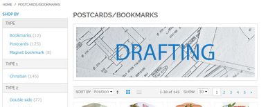
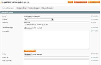
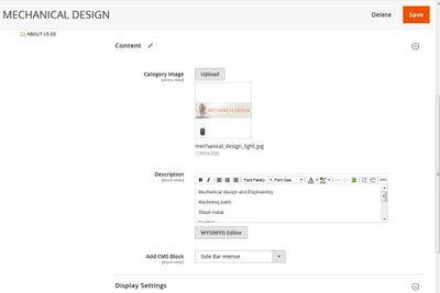
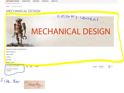
Why in M2 Category Content showing different than in M1? Before it was that any text of image added to the category displayed next to the left column, but in M2 now it stretched though out whole page below Menu/above left bar. Is it normal? Is there a way to change it in M2? Any idea?
Thanks in advance.
Please see images.
Magento 1

Solved! Go to Solution.
Accepted Solutions
- Mark as New
- Bookmark
- Subscribe
- Subscribe to RSS Feed
- Permalink
- Report Inappropriate Content
Hi @sandrik,
I think that "displaying incorrectly" isn't the right definition.
Magento2 is using (by default) a new theme called Luma and, as any other theme on any other version or edition, has particular things.
This isn't a recomednation but you can see Porto theme working as you want: http://newsmartwave.net/magento2/porto/demo1_en/fashion.html
Maybe you want to start to check the Catalog category view layout definition: vendor/magento/module-catalog/view/frontend/layout/catalog_category_view.xml
- Mark as New
- Bookmark
- Subscribe
- Subscribe to RSS Feed
- Permalink
- Report Inappropriate Content
Re: Magento 2 category content displaying incorrectly ???
Thank you @Damian Culotta for comment.
Yeah, I realized that Luma theme is different in many ways, plus Magento 2 platform too.
I think I found solution by using blocks and widgets. It is a little bit more work, but I got results I wanted.
Thanks again for help.


