Hi Guys,
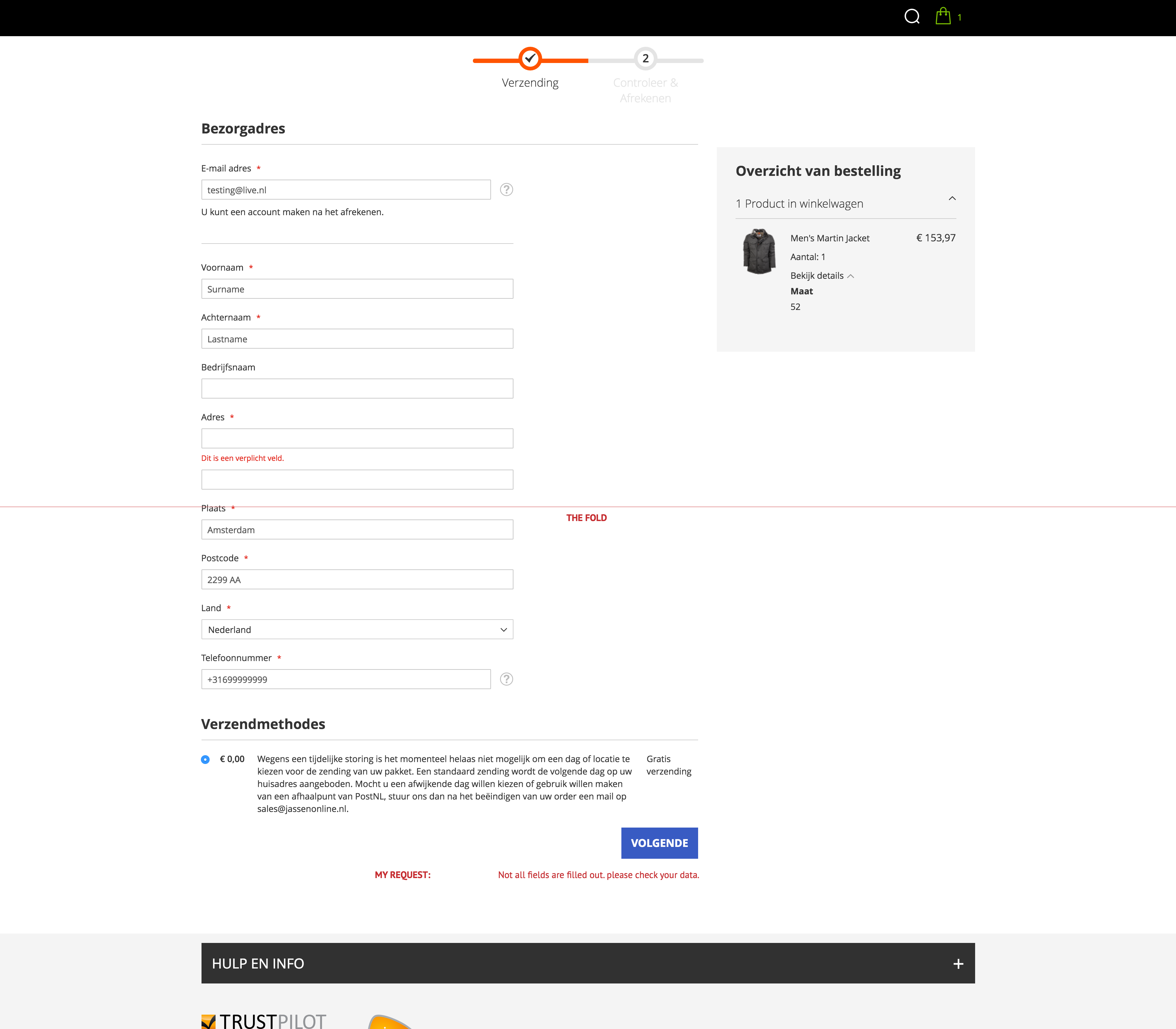
I would like to request a new improvement for the checkout. Currently users could have trouble finding out about invalid fields which disappear above the screen fold.
Scenario:
- User fills out his address information
- Scrolls down below to submit the form and go to the next step.
- Hey! The button is not working. Weird...
When the invalid fields are not visible because they are above the fold, the end user is not notified of the problems with his information. In some cases the user may be smart enough to scroll up and see if there are invalid fields, but you may understand that not every user is thinking about doing that.
Possible solution
- Automatically scroll to the first invalid field on the page
- Notification message below the submit form to inform the user that he has to fill out his invalid forms.
I am curious about what you guys think of this user experience issue.
Cheers,
Clarke
