- Forums
- :
- Core Technology - Magento 1.x
- :
- Magento 1.x Theming, Layout & Design Questions
- :
- Search Results Page Layout Issue
- Subscribe to RSS Feed
- Mark Topic as New
- Mark Topic as Read
- Float this Topic for Current User
- Bookmark
- Subscribe
- Printer Friendly Page
Search Results Page Layout Issue
- Mark as New
- Bookmark
- Subscribe
- Subscribe to RSS Feed
- Permalink
- Report Inappropriate Content
Search Results Page Layout Issue
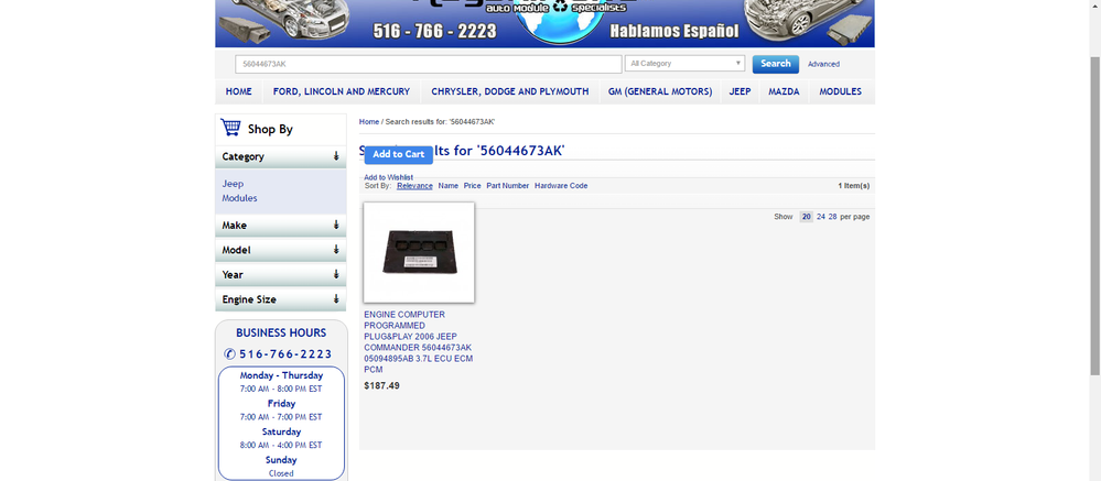
Recently came across a layout issue on my websites Catalog Search Results page. Whenever a search result returns 4 or less products the "actions" DIV with the price & add-to-cart button is displayed out of place above the product image and name (in grid mode). This element is positioned absolute and whenever I remove this css-style the div moves back below the image, however I need to keep this style otherwise it wont display correctly on all our category pages.
- Mark as New
- Bookmark
- Subscribe
- Subscribe to RSS Feed
- Permalink
- Report Inappropriate Content
Re: Search Results Page Layout Issue
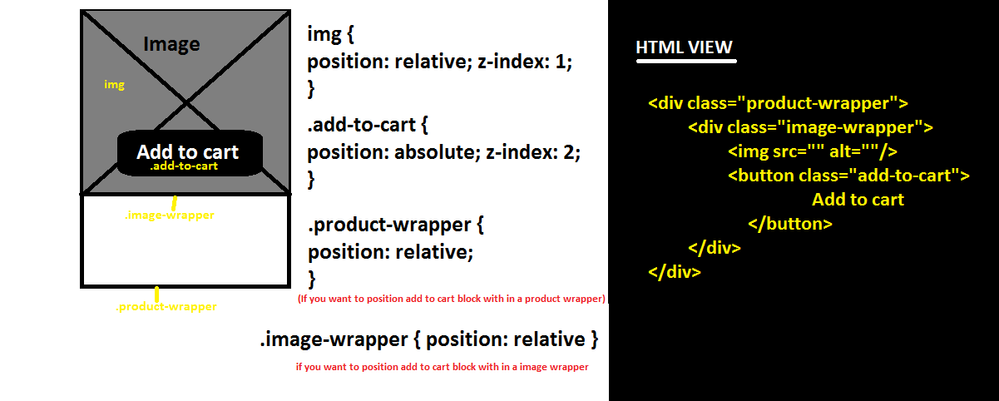
Add "relative" property value for parent wrapper.
for eg:
Please check attached screen shot
----------------------------------
some limitation was added on your local.xml file please remove that
Layout Path: 'your-theme/layout/local.xml'
Handler : catalogsearch_result_index
Take a look at Limit number of products shown list.phtml
{{block type="catalog/product_list" limit="4" category_id="13" template="catalog/product/list.phtml"}}
To accomplish this using layout.xml then use setLimit
<action method="setLimit">4</action>
Eg
<block type="catalog/product_list" template="catalog/product/list.phtml">
<action method="setLimit">4</action>
</block>
- Mark as New
- Bookmark
- Subscribe
- Subscribe to RSS Feed
- Permalink
- Report Inappropriate Content
Re: Search Results Page Layout Issue
Really appreciate the reply. I tried playing around with the css styles you suggested, however it seems I would need to re-work the Products Grid page in order to make it work the way you suggested. This seems like it would be counter-productive, as the product grid pages work as they should except for when there are 4 or less products being displayed. I then tried to follow the other suggestion you made regarding my local.xml file, but I also ran into issues there. I don't have a declaration in my local file referring to the catalogsearch_result_index handler. I also checked the list.phtml file and didn't see anything in there. Please advise.

